Components
The dashboard is built from a library of React components, exported from alinea/components. Use them in custom fields, Field.view sections and custom entry or root views, so your additions look and behave like the rest of the dashboard, in light and dark mode.
import {Button, Dialog, Table} from 'alinea/components'Actions and navigation
<Button><Toggle><ToggleGroup><Toolbar>- DocumentMetadataHistoryThe fields of the entry.
<Tabs> <Breadcrumb>- Read the style guide or contact support.
<Link> <FileTrigger>
Forms
<TextField><NumberField><SearchField>- Status
<Select> - Materials
<MultipleSelect> <ComboBox><Checkbox>- Locales
<CheckboxGroup> - Visibility
<RadioGroup> <Switch>- Publish date9232026
<DateField> - Opening time0930
<TimeField> - Launch date1012026
<DatePicker> - Sale period1127202611302026
<DateRangePicker> September 2026
S M T W T F S 3031123456789101112131415161718192021222324252627282930123<Calendar>- TagsLinenBedroomSummerSale
<TagGroup> <ColorSwatchPicker>- Or drag and drop images here.
<DropZone> - Horizontal focal point of the hero image
<Field>
Collections
- ImageTitleStatus
<Table> - Linen shirtMaya Janssens · 10:48DraftOak dining chairTom Verbeke · YesterdayPublished
<List> - HeroAutumn collectionProductsNew in linenQuoteFrom the workshop
<SortableList> - HomeLinen shirtOak dining chairDraftJournal
<Tree> - Status
- Published
- Created by
- Maya Janssens
- Path
- /products/linen-shirt
<DataList><ContentGrid><ContentCard>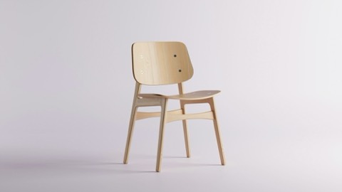
<MediaPreview>
Overlays
Delete “Linen shirt”?
This can’t be undone.
<Dialog><DropdownMenu>- Choose where this entry is shown.
<Popover> - Open preview in a new tab
<Tooltip> Blocks TextImageHeroQuote<Command>
Feedback and text
- Not translated yetThis product page has no French version.
<Alert> - PublishedDraftPage
<Badge> - No blog posts yetPosts you write in the journal show up here.
<Empty> <Spinner>- Published
- Last edited
<Timestamp>Oak dining chair
Materials
Care instructions
Visual size is independent of the element
<Heading>Stonewashed linen that softens with every wash.
Our Linen shirt is cut from European flax.
Last edited by Maya Janssens
In stockLow stockSold out<Text>The product lives at
/products/linen-shirtin theProductsroot.const Product = Config.document('Product', { fields: { title: Field.text('Title'), price: Field.number('Price') } })<Code>- ⌘ KEscSave a draft with ⌘ S
<Kbd> We build every chair to outlast the table it stands at.
<Blockquote><Icon><FoldIcon>
Layout
Shipping Free delivery on orders over €150.Belgium · 2 days<Surface>Machine wash at 40°C.
Tumble dry low, iron while damp.
<Collapsible>Linen shirt
Draft<Page><AppShell><Sidebar><NavRail>- PagesLinen shirtDetails
<ResizablePanelGroup> <PreviewFrame>
Entry points
Custom dashboard code imports from two entry points:
alinea/components: generic UI building blocks, such as buttons, inputs, dialogs and tables. They don't know about your content and work anywhere inside the dashboard.alinea/cms: what is tied to the CMS, such as the hooks that read and write field values, the entry being edited and the signed-in user,FieldChromeand the prop types of field, type and root views. See the alinea/cms API in Custom fields.


Usage
import {type FieldViewProps, useField, useFieldOptions} from 'alinea/cms'
import {Select, SelectItem} from 'alinea/components'
import type {Priority, PriorityField} from './Priority'

export function PriorityView({field}: FieldViewProps<PriorityField>) {
  const [value, setValue] = useField(field)
  const options = useFieldOptions(field)
  return (
    <Select
      label={options.label}
      value={value}
      onValueChange={next => setValue((next ?? 'normal') as Priority)}
      readOnly={options.readOnly}
    >
      <SelectItem value="low">Low</SelectItem>
      <SelectItem value="normal">Normal</SelectItem>
      <SelectItem value="high">High</SelectItem>
    </Select>
  )
}
The components are styled by the dashboard's stylesheet and theme, so they are meant for code that runs inside the dashboard.
Conventions
The API follows shadcn/ui and Radix, so the names will feel familiar:
Compound components are named after their parts:
Dialog,DialogTrigger,DialogContent,DialogTitle.Controlled and uncontrolled state use the same prop names everywhere:
value,defaultValueandonValueChange;checkedandonCheckedChange;open,defaultOpenandonOpenChange.Form controls take
label,description,error,required,disabled,readOnly,iconandshared, and render their label and messages withField.Dates and times are ISO strings (
2026-09-23,14:30). Collection keys are strings or numbers, and a selection is aSetof keys or'all'.Every component accepts
classNameandstyle. Each rendered part has adata-slotattribute (data-slot="dialog-content"), and variants are exposed asdata-variantanddata-size, which gives your CSS stable hooks.Colors, fonts and radii come from CSS variables such as
--alinea-fg,--alinea-bg,--alinea-border,--alinea-primaryand--alinea-radius. Use them in your own styles to follow the theme.
The props of every component are typed, so your editor shows what each one accepts. Types shared between components, such as Selection, Key and IconType, are exported as types from alinea/components too.
Icons
Components with an icon prop take an icon component (any component that renders an <svg>, such as those from react-icons or copied from Icones) or an element. The icons of the dashboard itself are exported from alinea/dashboard/icons.