MediaPreview
A thumbnail of an image or an icon for other files.
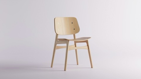
import {type FocusPoint, MediaPreview} from 'alinea/components'
import {useState} from 'react'

export function MediaPreviewExample() {
  const [focus, setFocus] = useState<FocusPoint>({x: 0.5, y: 0.6})
  return (
    <MediaPreview
      src="/catalog/oak-dining-chair.jpg"
      averageColor="#b59a7c"
      width={480}
      height={270}
      alt="Oak dining chair"
      focus={focus}
      onFocusChange={setFocus}
      style={{width: 320, height: 180}}
    />
  )
}
Props
An image preview with an optional, editable focal point
PropTypeDefaultDescription
srcstringDefault –The image, leave out while it is being resolved
placeholderstringDefault –A small image shown blurred behind the preview, eg. a thumbhash data url
averageColorstringDefault –Background color behind the placeholder
widthnumberDefault –Intrinsic width of the image, reserves its aspect ratio
heightnumberDefault –Intrinsic height of the image, reserves its aspect ratio
altstringDefault ''
focusFocusPointDefault –Shows a focal point marker on the image
onFocusChange(focus: FocusPoint) => voidDefault –Makes the focal point editable by dragging, clicking or with the arrow keys. Leave out for a read-only preview.
onFocusHover(focus: FocusPoint | null) => voidDefault –Reports the point under the pointer while hovering or dragging, and null once the pointer leaves
focusLabelstringDefault 'Focus point'Accessible label of the focal point control, defaults to "Focus point"
Also accepts className and style and data-* attributes.